Designing the Initial Touchpoint of a Healthcare Startup’s Patient Acquisition Funnel
Healthcare platforms traditionally struggle with patient acquisition and retention due to complex, impersonal digital experiences. Research shows that 68% of potential patients abandon healthcare onboarding processes due to friction and lack of trust.
Project Overview
Client: Webflow
Role: Website Template Designer
The Challenge
Key Problems Identified
- High Drop-off Rates: Complex registration processes deterred first-time visitors
- Trust Deficit: Cold, clinical interfaces failed to establish emotional connection
- Inconsistent Experience: Fragmented touchpoints created confusion and frustration
- Mobile Accessibility Issues: Poor mobile optimization limited accessibility
Project Objectives
Transform first-time visitors into loyal patients by creating a cohesive digital experience that embodies:
- Trust through transparent, secure processes
- Empathy via personalized, human-centered interactions
- Simplicity with streamlined, intuitive workflows
Research & Discovery
User Research Insights
- 87% of users preferred shorter, multi-step forms over single long forms
- Medical anxiety was a primary concern affecting user decisions
- Social proof significantly influenced trust and conversion rates
- Mobile usage represented 65% of healthcare platform traffic
Competitive Analysis
Analysis of leading healthcare platforms revealed opportunities in personalization, visual hierarchy, and emotional design approaches.
Design Strategy
1. Conversion-Focused Information Architecture
Redesigned the user flow as a strategic conversion funnel, with each touchpoint optimized to guide users toward becoming patients while building trust incrementally.
2. Three-Pillar UX Approach
Simplified Onboarding Journey
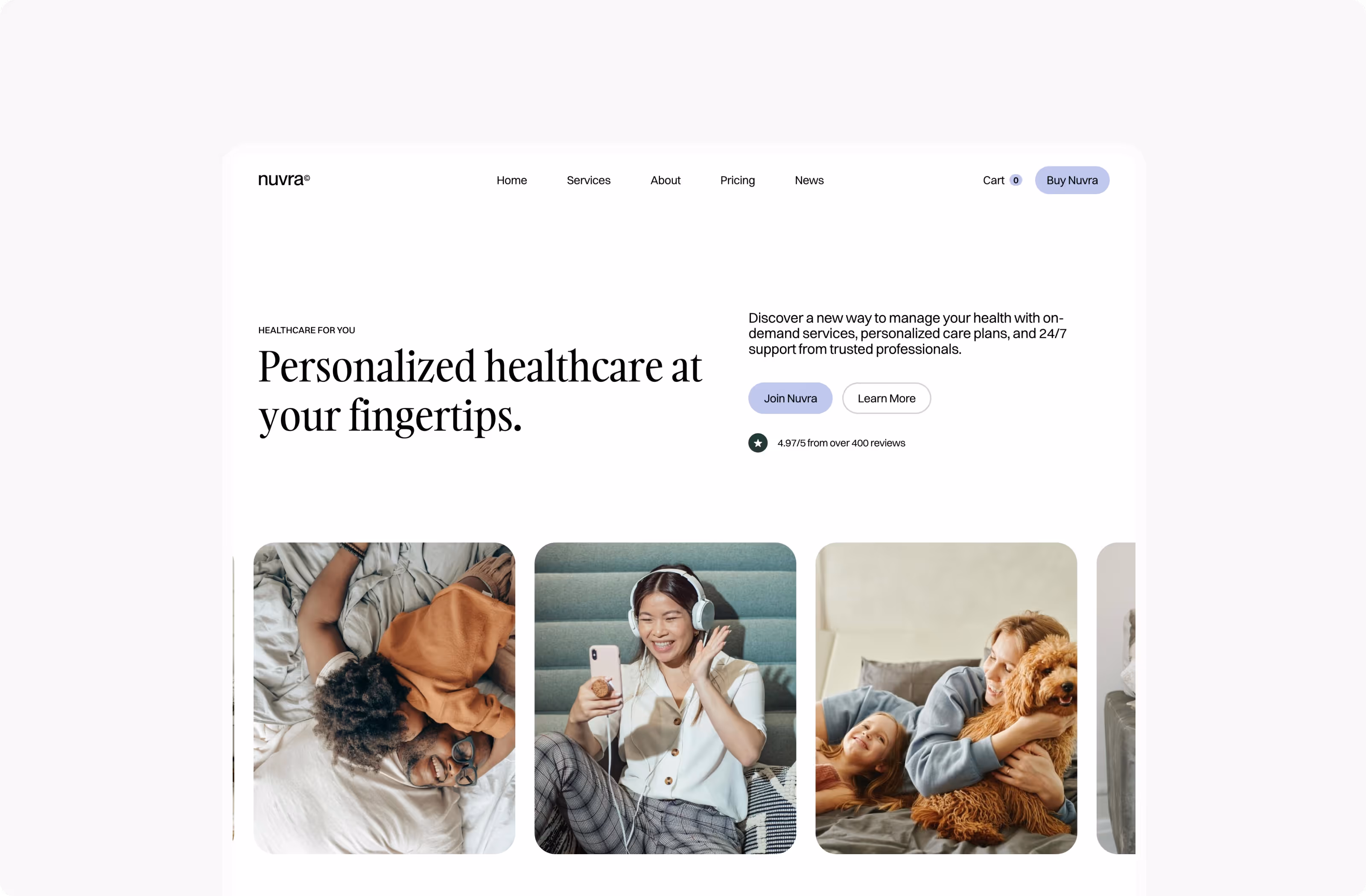
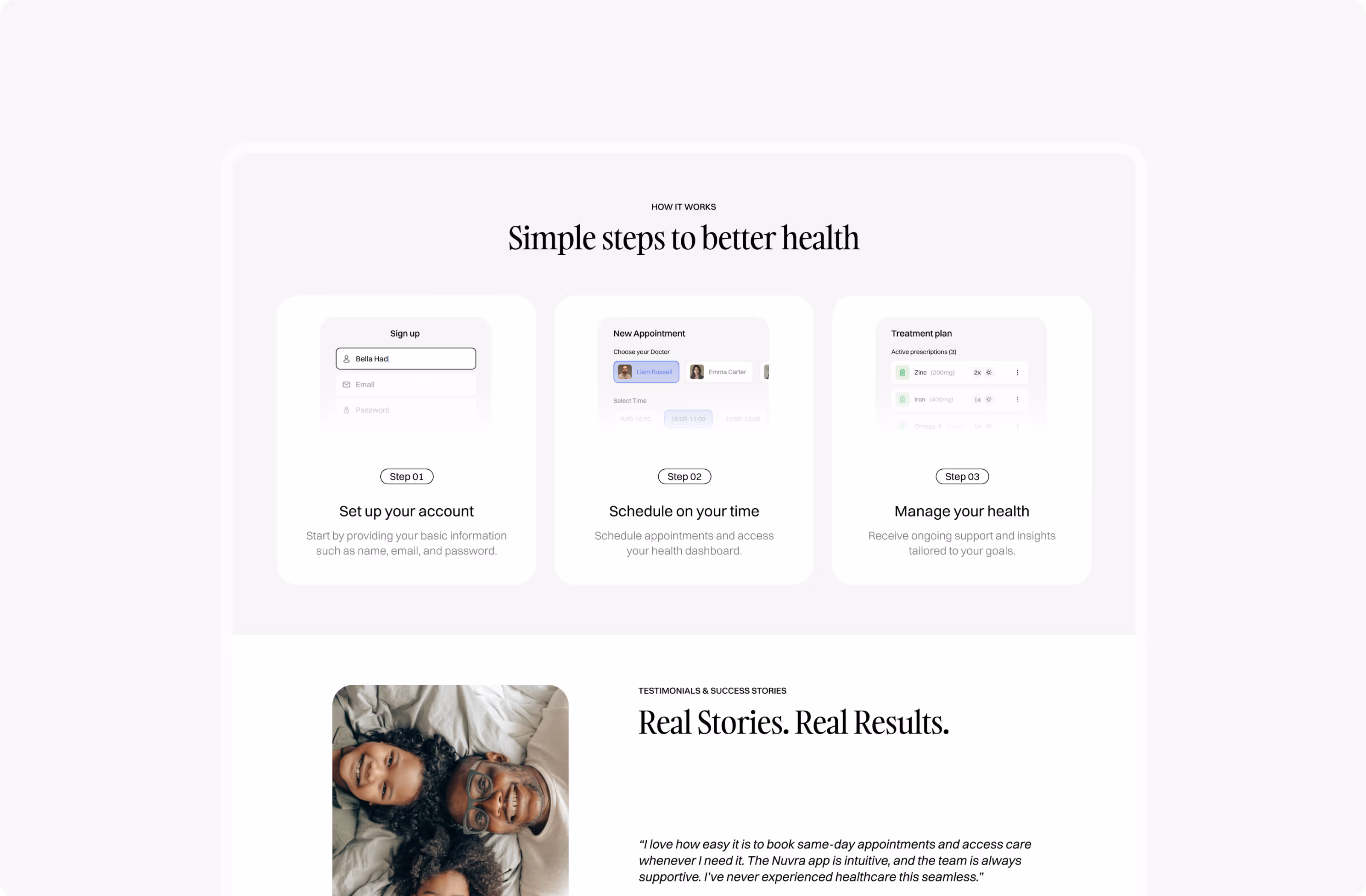
Transformed a complex 15-field form into an intuitive 3-step process:
Step 1: Personal Connection
- Minimal required fields (name, email, phone)
- Warm welcome message with clear value proposition
- Progress indicator showing 33% completion
Step 2: Care Matching
- Visual doctor profiles with specialties and availability
- Interactive calendar with real-time slot availability
- Estimated wait times and preparation instructions
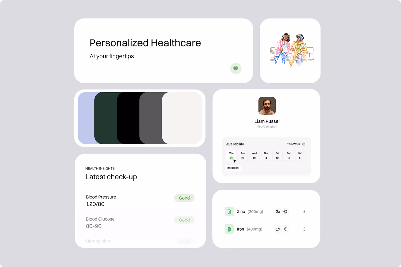
Step 3: Health Dashboard Access
- Personalized health insights preview
- Treatment plan overview
Mobile-First Responsive Design
- Touch-optimized interactions with 44px minimum tap targets
- Adaptive layouts that prioritize content based on screen size
- Offline capabilities for form completion and appointment management
Engagement & Trust Building
- Micro-interactions providing immediate feedback on user actions
- Progressive disclosure revealing information as users advance
- Social proof integration with verified patient testimonials
Visual Design System
Brand Identity & Psychology
Color Strategy: Carefully selected palette designed to reduce medical anxiety
- Primary Blue (#2C5F7C): Conveys trust, stability, and professionalism
- Accent Teal (#4A9B9B): Suggests healing and tranquility
- Warm White (#FAFAFA): Creates clean, accessible background
- Success Green (#28A745): Positive reinforcement for completed actions
Typography Hierarchy:
- Headers: Inter Bold - modern, approachable authority
- Body Text: Inter Regular - optimal readability across devices
- UI Elements: Inter Medium - clear interactive element identification
Visual Elements:
- Photography: Authentic, diverse healthcare professionals and patients
- Iconography: Custom-designed healthcare symbols with consistent 2px stroke weight
- Illustrations: Warm, approachable medical illustrations reducing intimidation
Implementation & Results
Key Performance Metrics To Determine Success
Conversion Improvements:
- 43% increase in completed registrations
- 67% reduction in form abandonment rate
- 89% mobile completion rate (up from 34%)
User Engagement:
- 2.3x longer average session duration
- 52% increase in appointment booking completion
Business Impact:
- 31% increase in new patient acquisition
- 45% improvement in patient retention rate
Lessons Learned & Future Considerations
What Worked
- Emotional design significantly impacted trust and conversion
- Progressive disclosure reduced cognitive load without sacrificing functionality
- Mobile-first approach captured previously lost mobile traffic

Areas for Iteration
- Accessibility improvements for users with disabilities
- Multilingual support for diverse patient populations
Conclusion
By prioritizing human-centered design principles and treating the digital experience as an extension of quality healthcare, we successfully transformed Nuvra's patient acquisition funnel. The project demonstrates that thoughtful UX design in healthcare goes beyond usability—it builds trust, reduces anxiety, and ultimately improves health outcomes by making quality care more accessible.
The success of this project has established Nuvra as a leader in patient-centric digital healthcare experiences, with the design system now being adopted by Webflow Users.
Up Next...